Twitter released a new blue bird as its sole logo mark and rid itself of the horrible bubble Twitter type and box with a “t”. Good job Twitter! This was nearly a fantastic move but fell flat on one account. Twitter should not have released a new twitter bird. Reinstate the old Twitter bird. The new Twitter blue bird has no character.
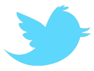
Besides the fact that I liked the old Twitter bird better there are reasons why the company should not have kicked it out of its nest.
- The old mark was more recognizable. Reeducating the mass public with a new logo can be difficult. Although any solid light blue bird has come to represent Twitter, changing the official one just seems superfluous.
- It had more character. The little puff of hair on his head, the curvature of the beak, and the small wings all were character traits and made the old mark more interesting. All those subtle lines told a story about the bird that no other bird had. Removing these elements reduces the bird to any number of the mass of blue birds that fly out my window. I don’t care about the masses. I want to see that one bird. This is up for debate but I believe the old Twitter bird could fly circles around the new bird and kick its butt.
- When a symbol can come to represent an idea/company it doesn’t need changing. The only thing that should be removed was the type. People know Twitter and they knew the Twitter Bird logo mark. It didn’t need cleaning up, a beak job, or a more modern look. The Mcdonald’s arch – the Nike swoosh – all have retained the original mark and got rid of the type that once supported it. The logo can stand on its own. Twitter should have done the same and kept the old Twitter bird.
Twitter has made the light solid blue bird a recognizable symbol and in the end this new bird will come to represent the company but sadly the recognizable bird that was full of character will be lost.
Leave a Reply